Fashion illustration
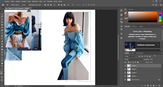
I started by defining the joints and silhouette then I focused on outlining her body itself before designing the clothes with the desired Styling.
Then I focused on designing my garment that I designed incorporating my initial pattern. I paid a lot of attention to the details and details that the fabric creates with the elastic
I thought about what would go well with my top and I didn't want it to be anything that would steal the top's attention, so I chose a pair of trousers. longer and wider because I have seen that they are also in trend for this year and added the creases in the front to make them more formal
After everything was drawn, I noticed that, next to the other 2d projects, the drawing was too translucent, so I decided to outline everything with a thicker pen to make it stand out more. I was careful to choose colors and brushes that made sense with the rest of the project.
For the background, I decided to use the same tones but with a different texture. Just a few scribbles with watercolor seemed like the right thing to do because it kept the effect simple but wasn't empty. I used it to give color and texture to the pants
The last step was to fill the top with my pattern and that was easy - put the pattern over the top and delete what was out of bounds
Then I added the earring and at the beginning I had already chosen this position strategically to see the earring.
I really enjoyed doing this illustration. In my opinion, it complements the rest pf the project and gives a practical way to it. Also, it is a suggestion on how we can use the elements such as the earring, the top and the pattern. I tried to make it with passion and there is nothing in this section of my project that I can regret.


Comments
Post a Comment