EXPERIMENTING - IMAGES LAYOUT
LAYOUT
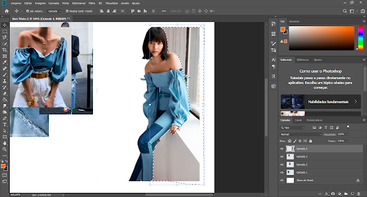
I am experiementig my pages layout because I am concerning about they look in the end. I want to think about the lettring, the position of the title and subtitle, the colors and think also about creating some slogans related to my theme and concept. I will work on photoshop to do this experiement, and if it goes well, I will use photoshop for the final outcome. For this experiment, I will use an image as an example because I will only focus on the layout, letring and colors.
Here are my tries:
1
2


Good that you have practiced this as you will ned to choose a good layout and if you have this in mind hopefully this will be ready to execute - good work
ReplyDelete